case study
/
Jewelry
/
Fashion
Aura Love Yourself
How a Self-Care Brand Built its Entire Visual World from Scratch
Main Image
Image Stack
A+ Content
Video
Photo
Before Pinestel
The self-care market is loud. Every brand is whispering "slow down" at full volume. Candles with mindfulness messaging. Serums promising inner peace. It's a category full of good intentions and exhausted aesthetics.
Aura Love Yourself was built on something real. The founders believed that self-love should feel simple, beautiful, and daily - not aspirational, not clinical. They had a name, a vision, and a product line that meant something. What they didn't have was a way to prove any of it.
The vision was there. The content wasn't. And in a category this visual, that gap is everything.
The Challenge
A brand that couldn't express itself - The vision was clear. The visual language wasn't. Aura had branding on paper and nothing in the world.
Zero content to sell with - No photography, no video, no assets. Nothing to put in front of a customer.
A saturated category with no room for generic - Self-care is crowded. Pretty pictures aren't enough. Aura needed a distinct visual identity - or it would disappear into the noise.
Prelude
Self-care brands are everywhere. Most feel clinical - like a prescription. Or performative - like a photoshoot pretending to be a moment. Neither one is true.
What Aura understood - and most brands miss - is that the ritual matters more than the product. It's not what you buy. It's what you do with it. The pause. The breath. The small, intentional act of choosing yourself.
That was the thread we followed into every frame. Not jewelry. Not product. The ritual.
Sell More With Pinestel
Wondering how your own catalog would hold up to this kind of audit?
Most people don't know. The numbers usually do. See how we audit and rebuild.
The Creative Strategy
The brief looked simple: build a visual world for a brand that had none. But the real question was harder.
How do you make someone feel something before they've ever touched the product?
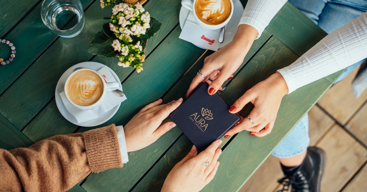
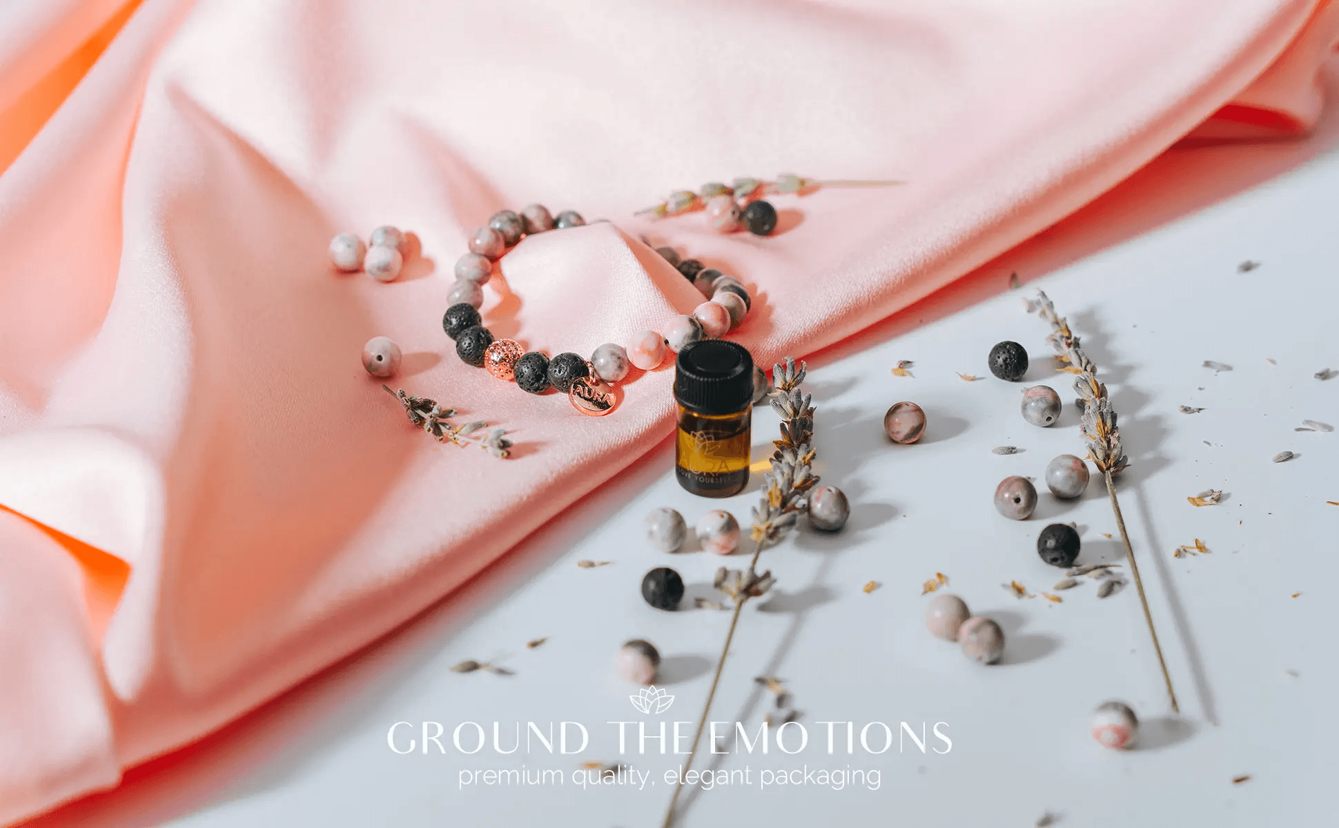
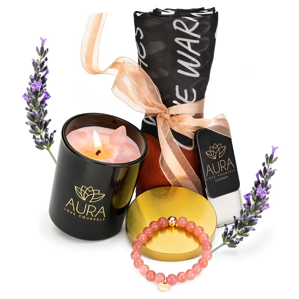
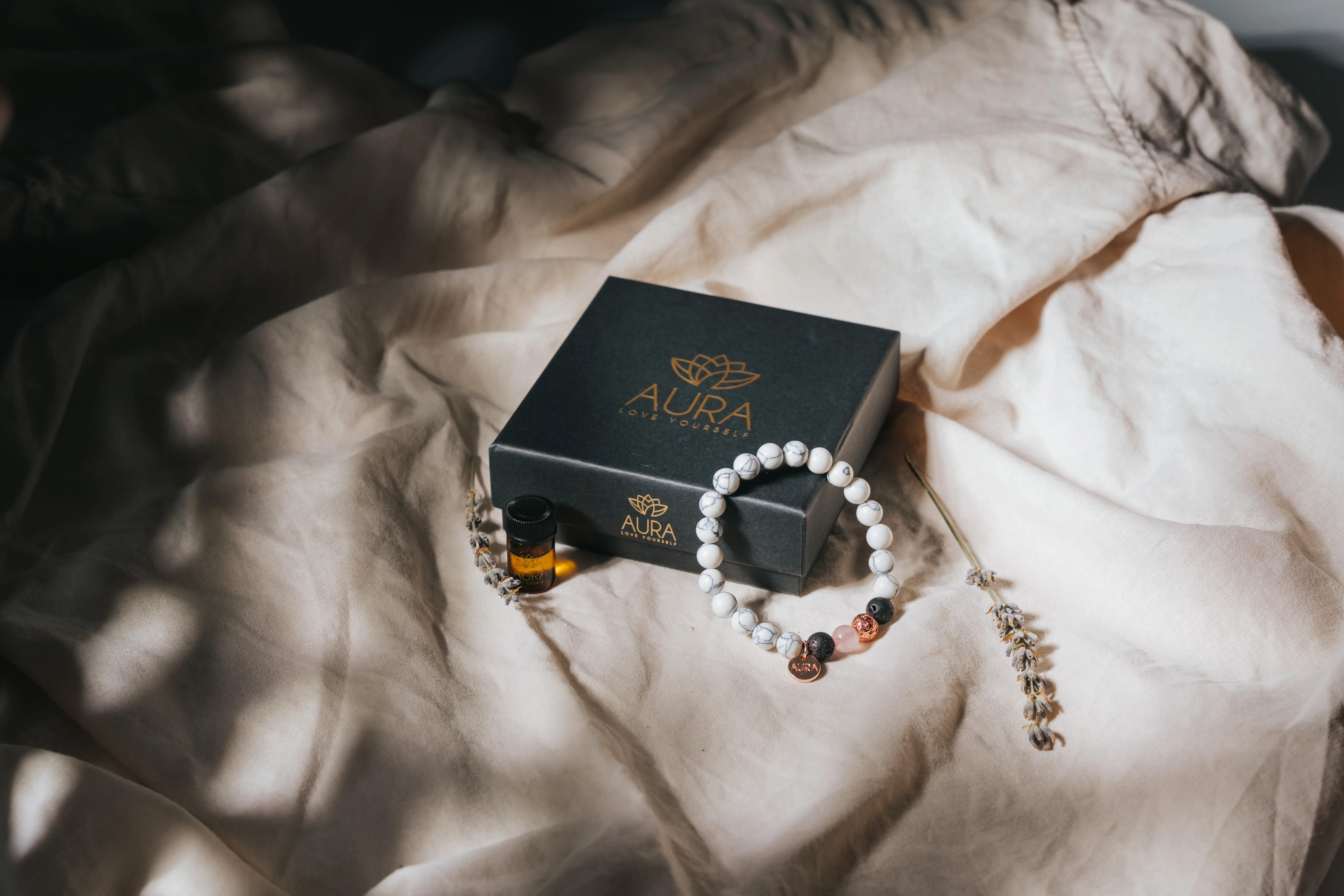
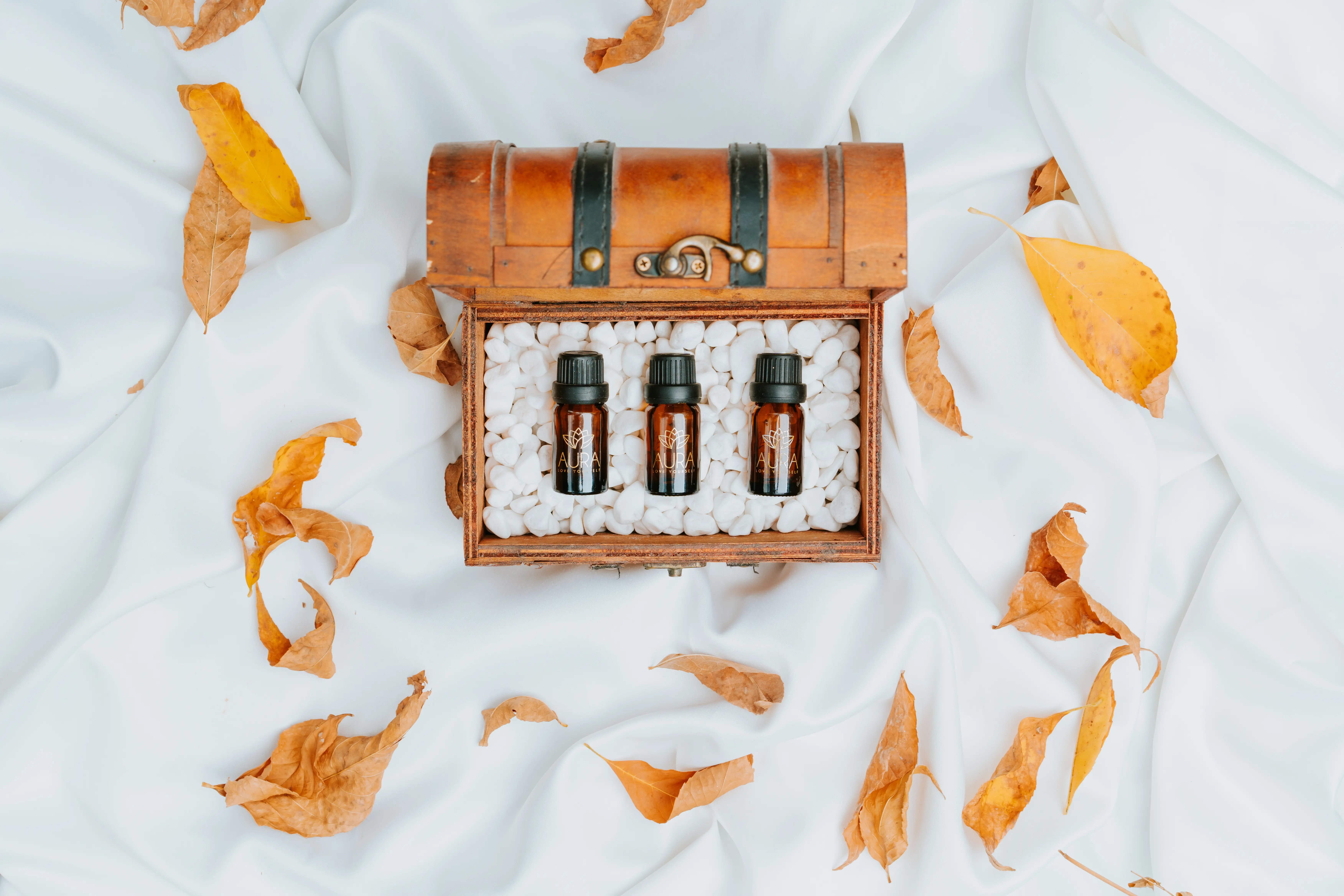
The answer was restraint. Warmth over perfection. Texture over gloss. We made a deliberate choice to keep things intimate - not polished into something cold and unreachable. Every frame had to feel like it belonged in someone's morning routine, not a mood board.
What We Built
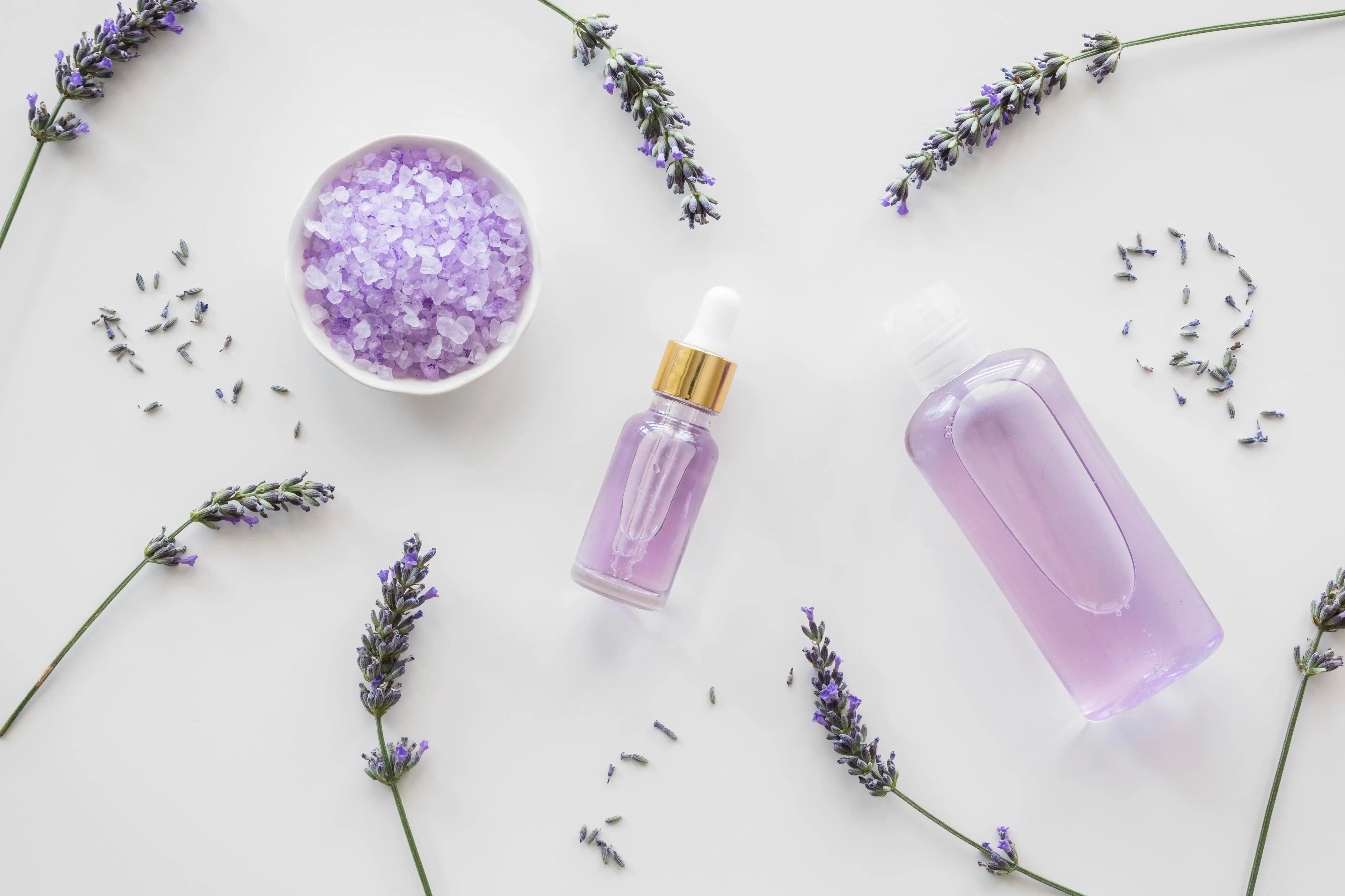
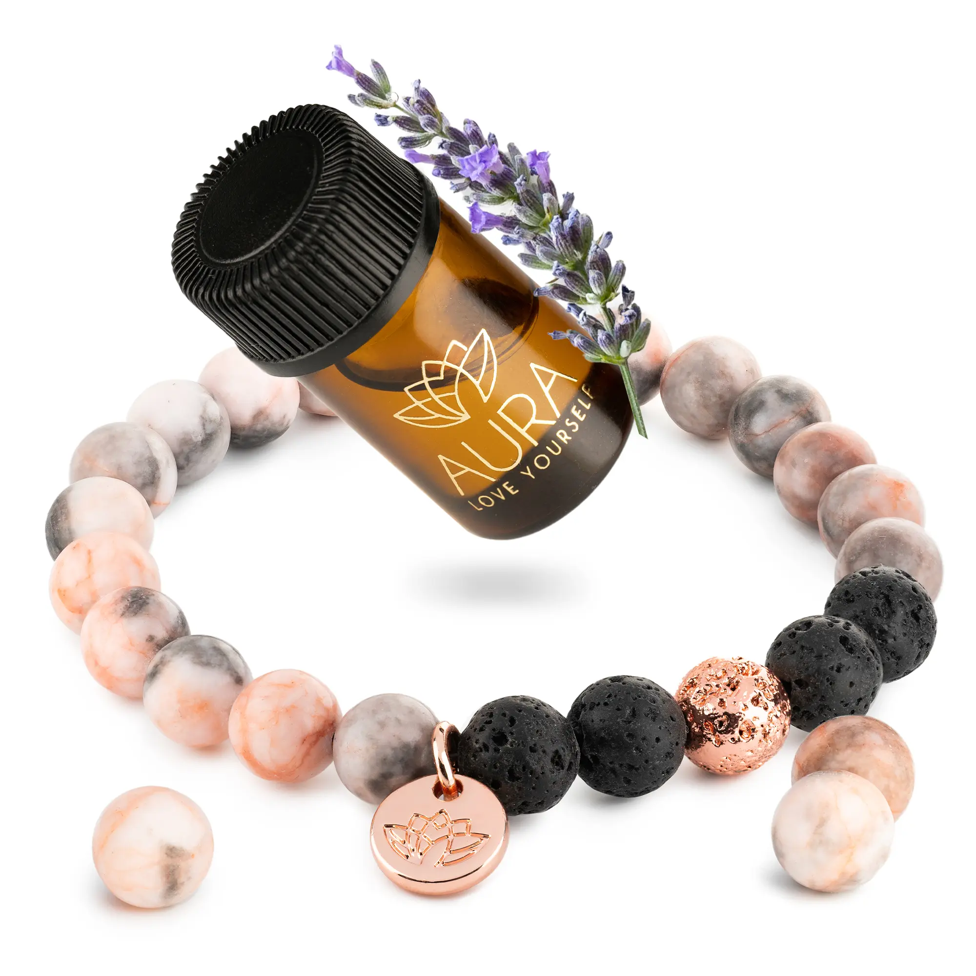
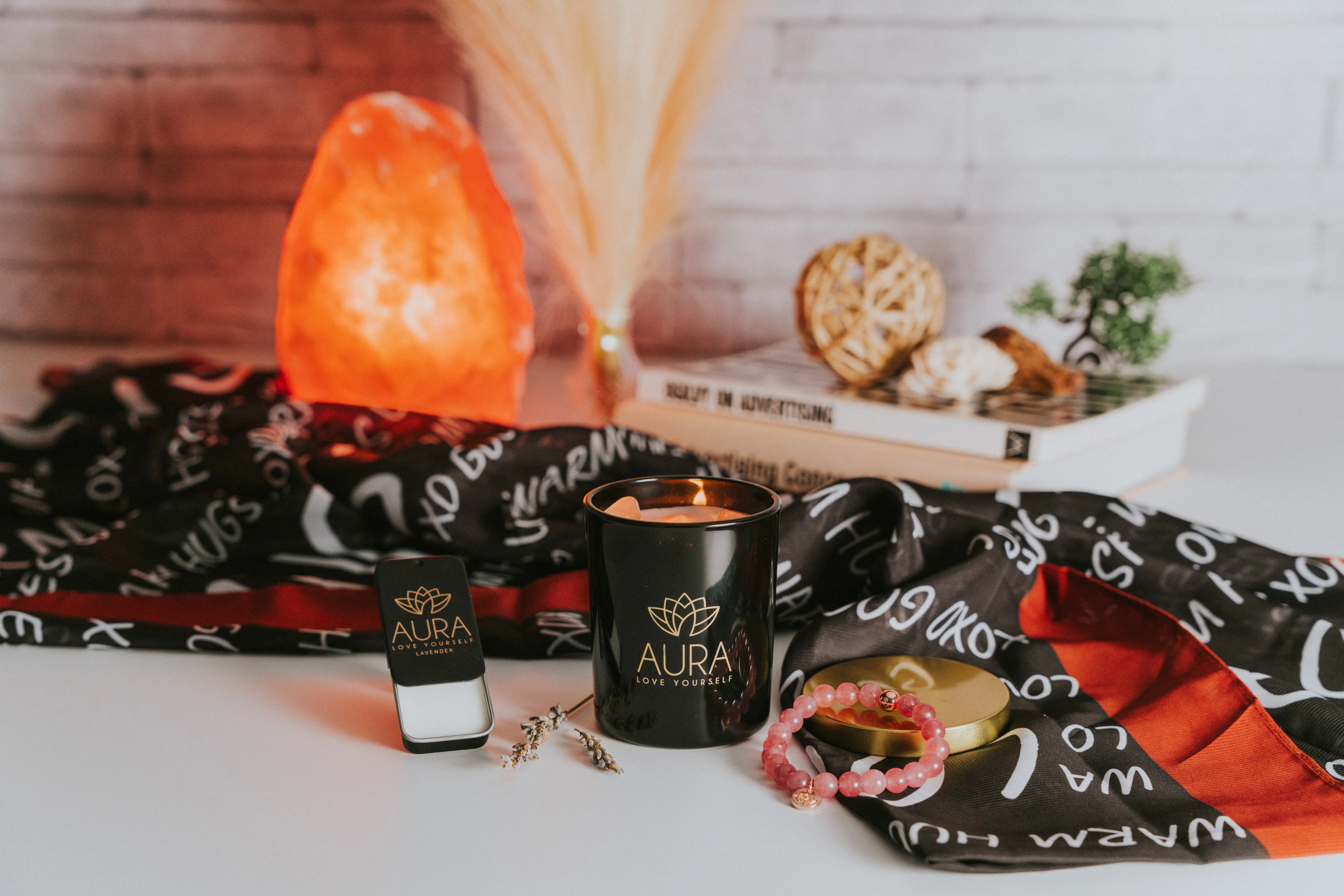
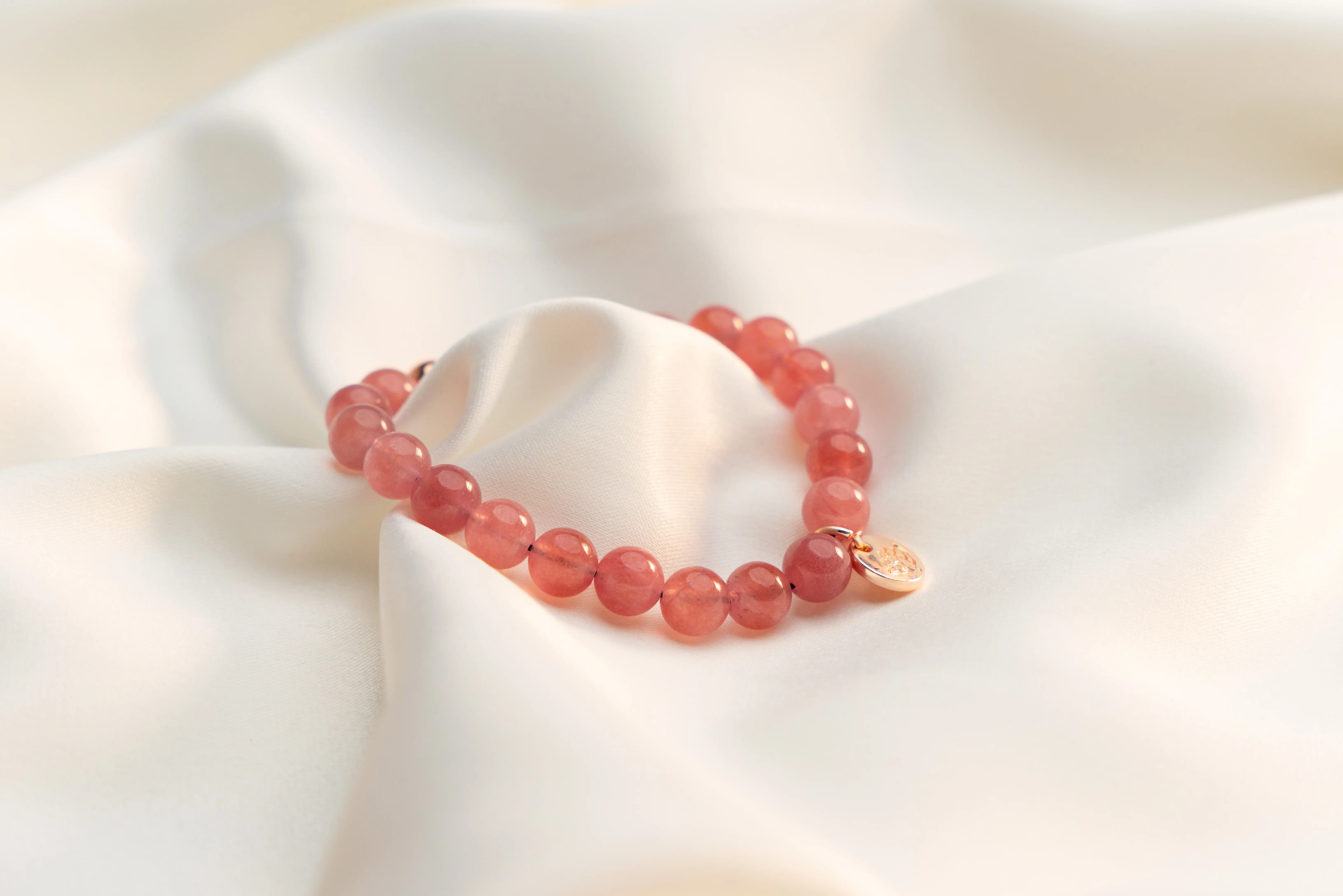
Product Photography - Clean, warm, intentional. Shot to feel like a quiet moment, not a campaign.
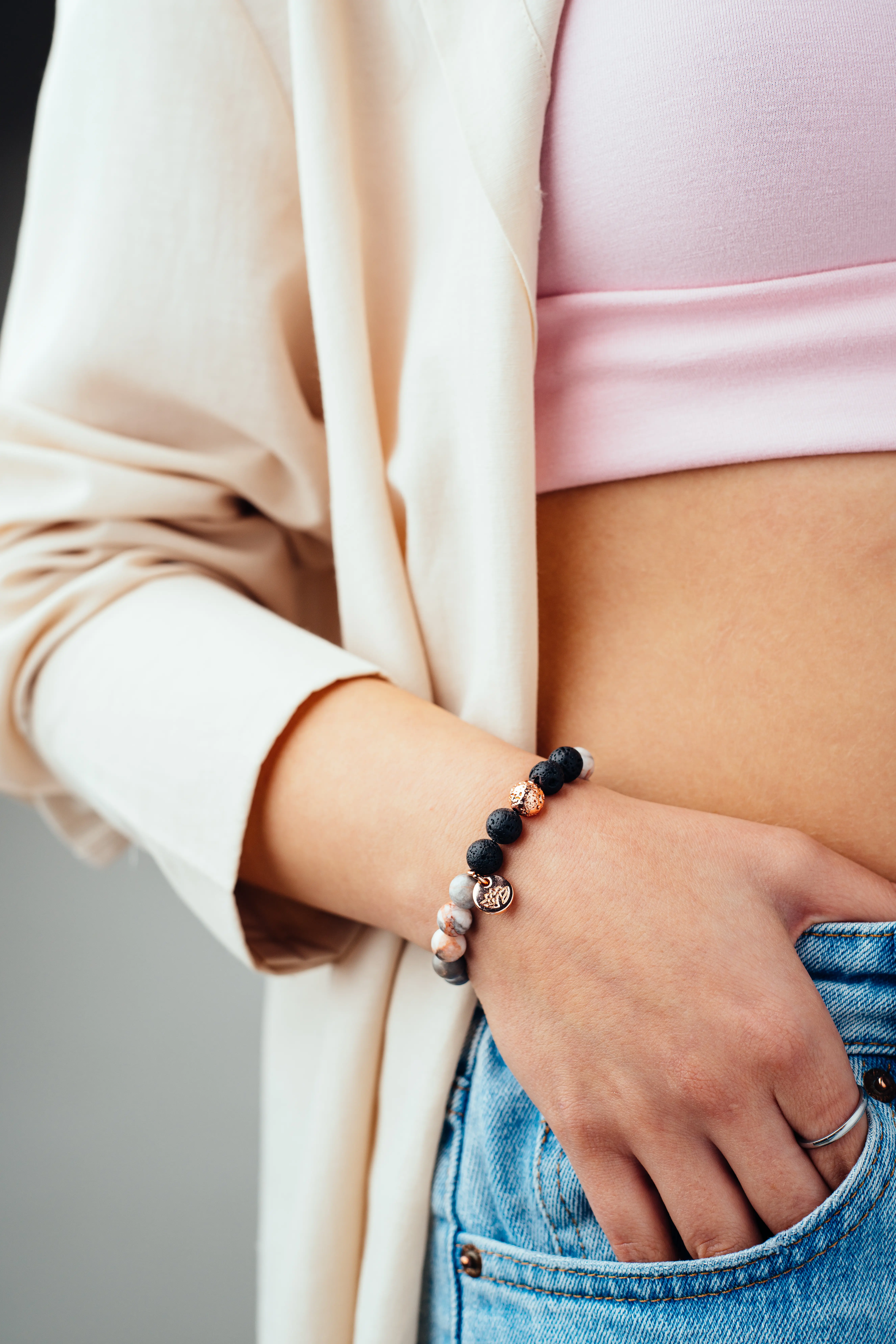
Image Stacks - Multiple lifestyle and detail compositions built to work across every touchpoint - listings, storefront, social, and beyond.
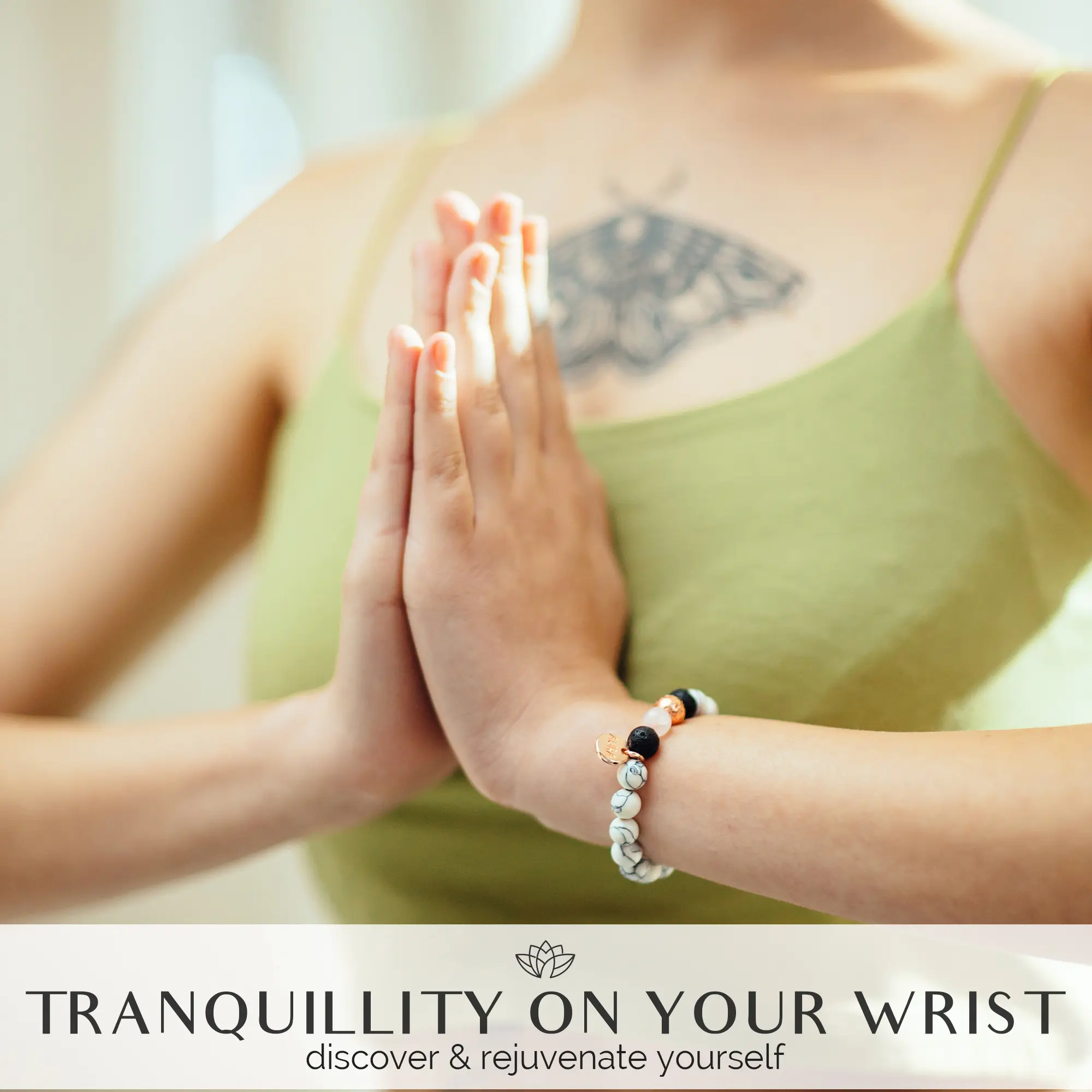
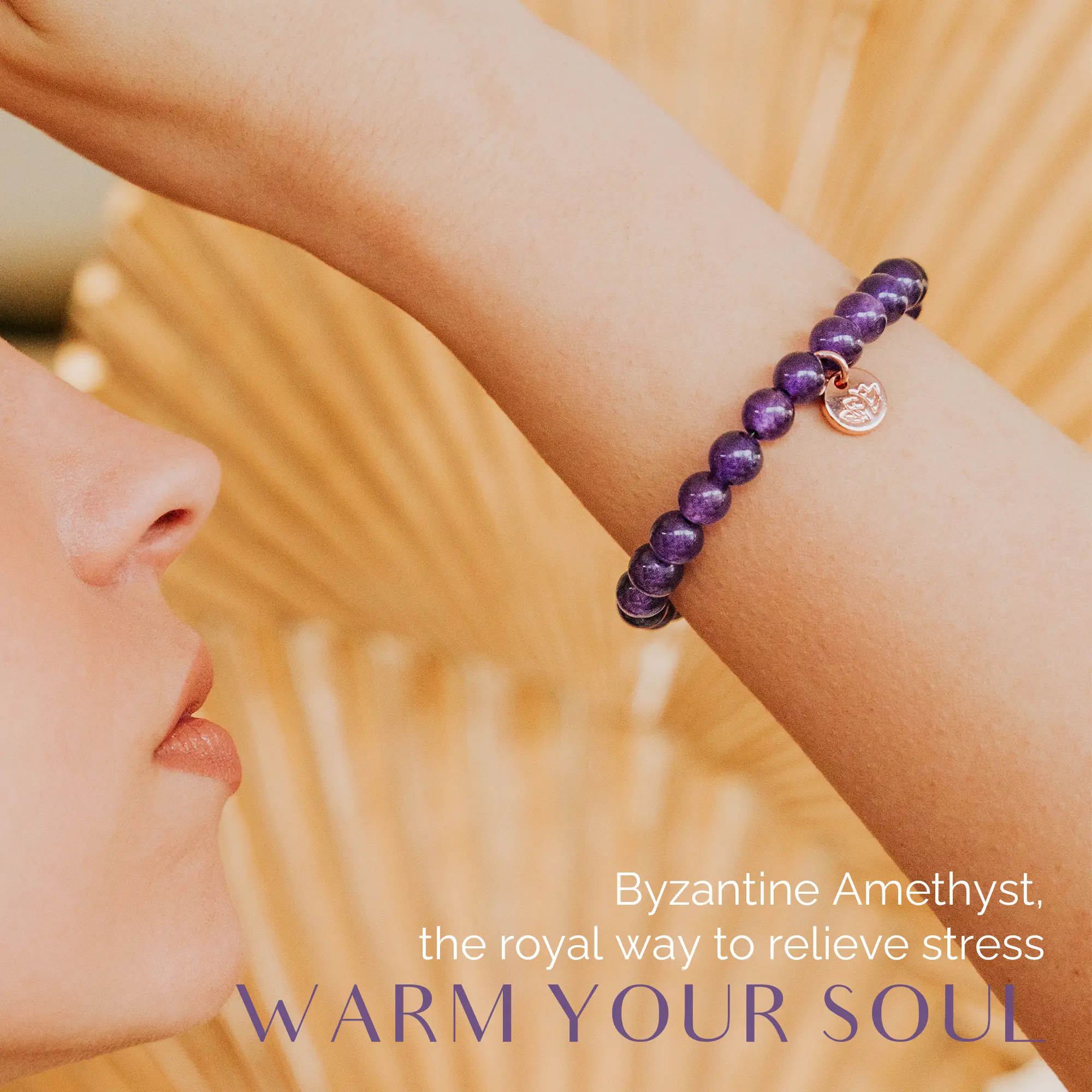
A+ Content - A full content module sequence that tells the Aura story the right way: ritual first, product second.
Promotional Videos - Mood-forward, minimal, built to stop a scroll. True to the brand's voice without overselling it.


What We Learned
The brands that resonate don't try to sell you something. They invite you into a feeling. Aura didn't need more noise - it needed a quiet visual language that let people opt in on their own terms.
The best creative work doesn't push. It pulls.
Gallery


Other Case Studies

Beauty
L'essenziale Puro Moroccan Argan Oil, Branding & Amazon Listing Update
How We Built a Premium Brand Identity and Rebuilt an Amazon Listing That Wasn't Doing the Product Justice

Beauty
Vivyra 4-in-1 Multipurpose Brush, Establishing a Visual Language for a Fresh Launch
How We Launched a Cosmetics Brand That Looks Like It Belongs on the Shelf Next to the Market Leaders

Tech
Crave PowerHub Pro Packaging & Visual Identity
How We Built a Complete Retail and Amazon Visual System Before a Physical Product Ever Existed