case study
/
Luxury
Wordsworth & Bläck
How a Fountain Pen Brand Crossed $1M in Revenue
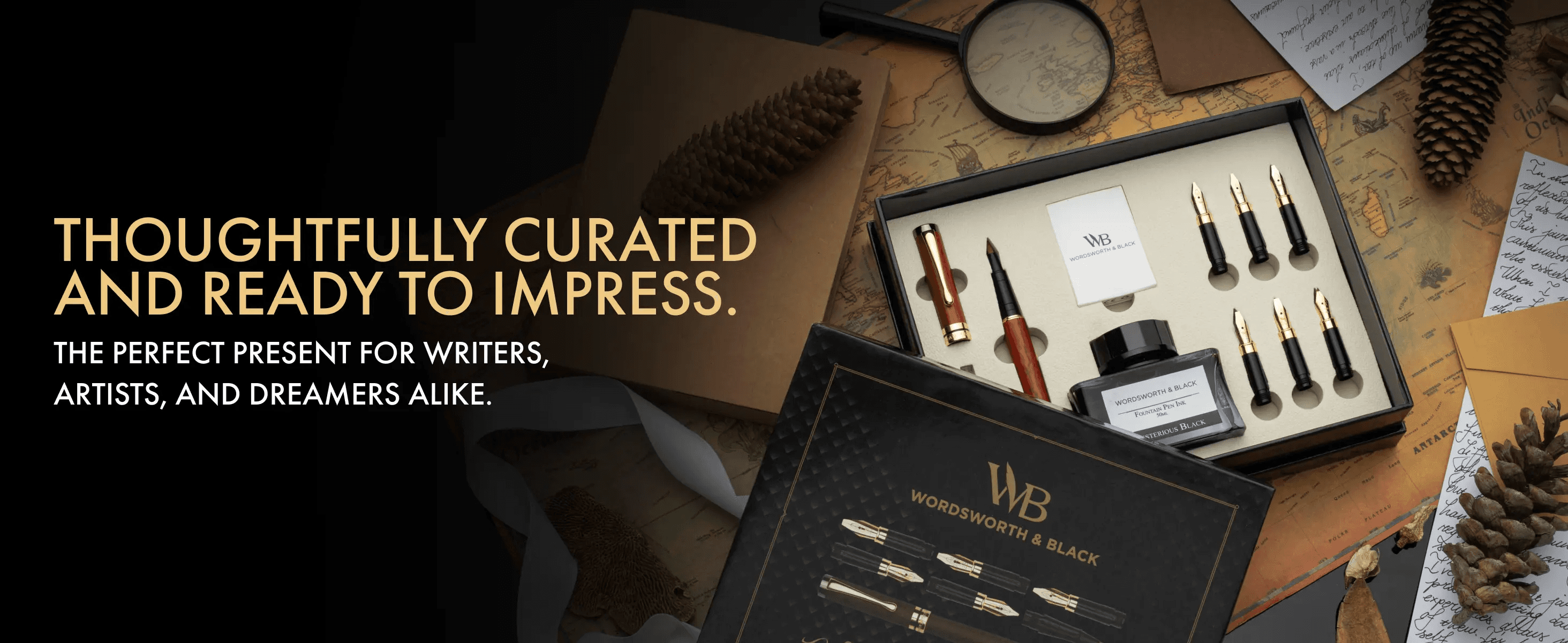
Main Image
Image Stack
A+ Content
Storefront
Video
Photo
Rebranding

Before Pinestel
Fountain pens are not impulse purchases. They're chosen. The buyer holds the product in their mind before they hold it in their hand - imagining the weight, the feel, the ritual of it. That kind of purchase demands a brand that earns the fantasy before the checkout.
Wordsworth & Bläck understood their product. What they didn't yet have was a presence that matched it. When they first reached out to Pinestel, the brief was straightforward: revamp a single Amazon listing. Clean it up. Make it look better. Simple enough.
But the more we looked, the more we saw. Behind that one listing was a brand with real depth - timeless design, functional elegance, and a genuine emotional connection to the act of writing. This wasn't a product problem. It was a positioning problem. And one listing wasn't going to fix it.
The Challenge
Wordsworth & Bläck didn't just need better images. They needed a foundation:
No cohesive brand system - The visual language across listings, content, and storefront was inconsistent. Nothing felt intentional.
A product that outsold its presentation - The pens were premium. The creative wasn't keeping pace.
A crowded category with a clear ceiling - To own fountain pens on Amazon, you can't just compete. You have to set the standard.
Our Approach
The writing instrument market has a peculiar tension. It sits at the crossroads of utility and luxury, functional enough for everyday use, precious enough to gift. Most brands pick a side. The ones that win learn to live in both worlds at once.
That was the insight that shaped everything. Wordsworth & Bläck didn't need to shout. They needed to command. The creative had to do what the product already did: feel inevitable. Like the only choice worth making.
What started as a single deliverable became a full-scale brand partnership - and a long-term one at that.
Sell More With Pinestel
Wondering how your own catalog would hold up to this kind of audit?
Most people don't know. The numbers usually do. See how we audit and rebuild.
The Creative Strategy
The central question wasn't how do we make this look better? It was: what does it feel like to choose Wordsworth & Bläck?
Every asset had to answer that, from the first image a buyer sees to the last line of copy before they add to cart.
The framework: Aspiration → Craftsmanship → Function → Ritual → Conviction.
Draw the buyer into the world first. Then prove the product belongs there.
What We Built
Catalog Creative - A complete visual overhaul across listings. Cinematic photography that treated each pen like an object of desire, not just a product on a shelf.
A+ Premium Content - Elevated brand storytelling within the Amazon ecosystem. Rich modules that communicated heritage, precision, and the pleasure of writing.
Product Listing Video - Video content that captured the tactile experience of the product: ink meeting paper, light catching metal, the quiet ritual of a good pen.
Brand Identity & Voice - A visual and tonal system that could scale - giving the brand consistency across every touchpoint, on Amazon and beyond.


What We Learned
The best brand work starts when you look past the brief. Wordsworth & Bläck came to us with a listing. What they needed was a language, a way of showing up that made the product's quality undeniable before a single word was read.
When you get that right, the category doesn't just recognize you. It defers to you.
Gallery


Other Case Studies

Beauty
L'essenziale Puro Moroccan Argan Oil, Branding & Amazon Listing Update
How We Built a Premium Brand Identity and Rebuilt an Amazon Listing That Wasn't Doing the Product Justice

Beauty
Vivyra 4-in-1 Multipurpose Brush, Establishing a Visual Language for a Fresh Launch
How We Launched a Cosmetics Brand That Looks Like It Belongs on the Shelf Next to the Market Leaders

Tech
Crave PowerHub Pro Packaging & Visual Identity
How We Built a Complete Retail and Amazon Visual System Before a Physical Product Ever Existed